The Market Pricing chart compares the number of properties sold during the most recent (“last”) time frame selected to the number of properties sold during the previous time frame of the same duration (as on Tab 2) with the addition of median price information for each time period.

Median Price
|
•Last # Days: The number of properties sold during the most recent time period selected in the Sold Time Frame drop-down list. The vertical green dotted line indicates the median price of all properties sold. •Previous # Days: The number of properties sold during the prior corresponding time period. The vertical gray dotted line indicates the median price of all properties sold. |

Sold Time Frame
|
•You can choose the most appropriate date range for comparable properties (Last 365 Days is the default). |

Units Scale
|
•When a smaller time frame is selected, the y-axis (# Units) is not rescaled -- the chart bars just become shorter in height. •To resize the chart to fill available space when, and if, the data selected is concentrated towards the bottom of the chart, click the Reset Y-Axis button. |

Market Pricing Charts Units Scale
Units
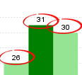
•You can display the number of properties represented by each bar by clicking the # Units from the chart controls.
|
|
More Data
|
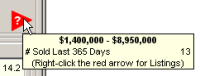
•A red arrow indicates there are property records outside of the chart view. • Hover your mouse pointer over the arrow to display the number of listings and the price range in which they fall. • Right-click on the tooltip to display a list of the properties. |