The Market Size chart allows you to measure changes in market size (sales activity) over sequential time periods. Two bar charts (frequency histograms) are displayed on the chart to visually indicate the time periods involved and what has changed, i.e. bar heights and histogram shifts. The solid green histogram always represents the most contemporaneous time period (e.g. last 180 days); and the black outlined (transparent) histogram always represents the prior time period of equal duration (e.g. previous 180 days). Comparing the two histograms provides a quick visual indicator as to how the market has changed in size between the two time periods. Because bar height is a direct measure of sales activity you can quickly determine if the size of the market has increased, decreased or stayed about the same:
•Market size is increasing if the green bars are generally taller than the black (outlined) bars
•Market size is decreasing if the black (outlined) bars are generally taller than the green bars

Number of Sold Properties
|
•Last # Days: The number of properties sold during the most recent time period selected in the Sold Time Frame drop-down list. •Previous # Days: The number of properties sold during the prior corresponding time period. |
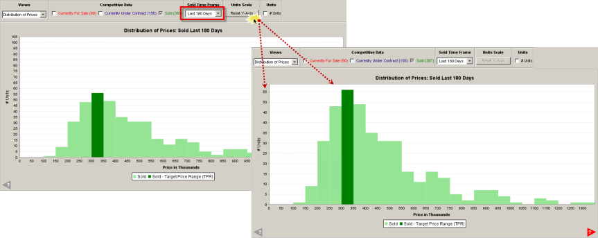
Sold Time Frame
|
•You can choose the most appropriate date range for comparable properties (Last 365 Days is the default). |

Units Scale
|
•When a smaller time frame is selected, the y-axis (# Units) is not rescaled -- the chart bars just become shorter in height. •To resize the chart to fill available space when, and if, the data selected is concentrated towards the bottom of the chart, click the Reset Y-Axis button. |
Units
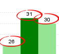
•You can display the number of properties represented by each bar by clicking the # Units from the chart controls.
|
|
More Data
|
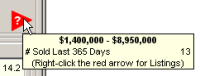
•A red arrow indicates there are property records outside of the chart view. • Hover your mouse pointer over the arrow to display the number of listings and the price range in which they fall. • Right-click on the tooltip to display a list of the properties. |