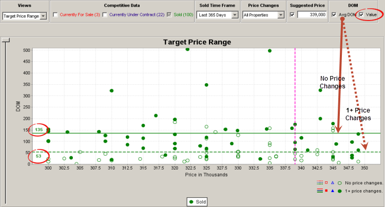
The Target Price Range chart provides a view of how properties are distributed relative to price and time on market (DOM).
A simple scatter chart is used to display the individual properties within the Target Price Range in a manner analogous to pushpins on a graphical map. The scatter chart functions as a Price vs. DOM coordinate system so that a property’s symbol location reflects meaningful market information, i.e. its horizontal position indicates its current (or last) price point, and its vertical height signifies time on market.
The table below the chart displays the profile of the most typical property found within the Target Price Range from a BD, BA, SQFT & Lot Size perspective.

Competitive Data
|
You can display any combination of the following: •Currently For Sale •Currently Under Contract •Sold properties (Default) The numbers in parentheses represents: •Currently For Sale: The number of listings that are for sale now •Currently Under Contract: The number of listings are are under contract now •Sold: The number of listings that closed escrow during the time period selected in the Sold Time Frame drop-down menu |
Sold Time Frame
|
•You can choose the most appropriate date range for comparable properties (Last 365 Days is the default). |

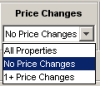
Price Changes
|
Display listings according to their price change histories, i.e. those properties with no price changes, those with 1+ price changes, or the All Properties blend (All Properties is the default). |
Suggested Price
|
•The Suggested Price entered on the search screen, if any, will be displayed here. • If you did not enter a suggested price on the search screen, or wish to change it, just type it into the text box. •When the checkbox is selected, a pink dotted line will be displayed on the chart. |
DOM
|
You can display the difference in average sales times between properties with no price changes versus those with one or more. |
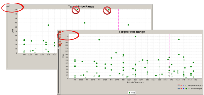
Slider
|
Stretch the chart background to facilitate viewing low DOM properties that have been pushed to the bottom of the chart by the presence of one or more high DOM properties. |
Key to Symbols
|
•Hollow symbols on the chart represent listings that have experienced no price changes. •Solid symbols represent listings that have experienced one or more price changes. |