MLS Median Price Trend Charts is
•Reflective of the collective actions of all buyers and sellers during this time period on a quarter-by-quarter basis across your MLS.
•Each quarterly slice in the chart is a representation of how existing market forces affect buyer/seller behavior from both a price and market activity perspective.
•Illustrates where the market has come from and "points" to where it is headed.

MLS
|
•If you have access to more than one MLS, the default MLS displayed will be based on alphabetical order of your MLS's. •You can switch MLS's by choosing a new MLS from the MLS drop down box. •The charts and grids are updated based on the new MLS chosen. |
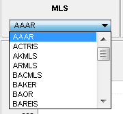
Chart Views
|
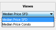
You have two chart views: oMedian Price SFD - displays sold median $, units sold, average sold price and sold $ per square foot for single family detached properties up to the last ten years broken down by quarter. oMedian Price Condo - displays sold median $, units sold, average sold price and sold $ per square foot for condominiums properties up to the last ten years broken down by quarter. |
|
•You can quickly view median price, sell units, average sell price and average sold price per square foot by hovering over any bar in the chart area. •The data displayed is based on the bar selected. |
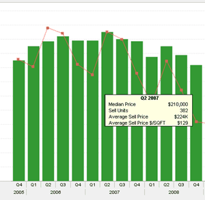
Chart Controls
|
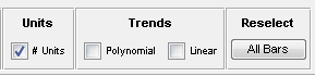
Units: Toggles units sold on or off on the chart. By default, Units is toggled off. Trends: Toggles Polynomial and Linear trend lines on or off. Reselect: Selects all bars on the chart. |
Selectable chart bars
You can Customize any 1-, 2- or 3-year view:
1.Click on any bar in the chart.
2.Hold down the shift key and click on another bar.
•The key information grid and corresponding arrow(s) will be recalculated based on the first and last periods in the selected group of chart bars.
•Click the All Bars button chart control to reset the selections back to the default.
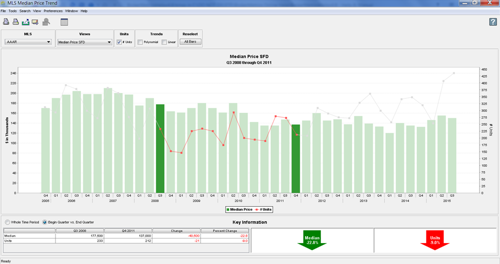
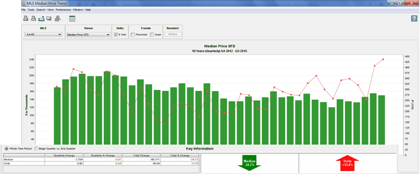
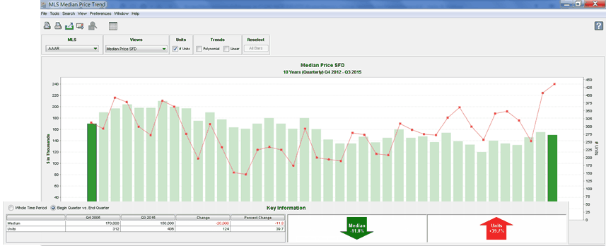
Key Information
Whole Time Period
This grid displays the incremental change during the time period, using the Linear Least Squares calculation method; it corresponds to the Polynomial Trend Line chart control. Since the value of each time period is used in the calculation, all of the chart bars have the same color intensity.
Begin Month vs. End Month
This grid shows the difference between the values of the two full color-intensity bars; it corresponds to the Linear Trend Line chart control. Since the values of the intervening bars are not used in the calculations, the color of these bars is a lighter shade.
Switching to Grid View
|
•You can quickly switch to chart view by clicking the Grid icon. |
