Tabs
![]()
Market Dynamics charts are shown on three tabs:
Price
These charts display information depicting the movement of average and median prices.
Supply & Demand
These charts portray the relationships between the numbers of listings in each status category.
Sales Rate
These charts illustrate the sales activity pace.
Chart controls
![]()
The selection of controls varies by chart.
Bank mode button
![]()
Clicking the Bank mode button will provide four views that compare the activity of properties that have various forms of bank involvement (foreclosures, REOs, short sales, etc., depending on the categories available in your MLS) to the activity of properties without bank involvement.
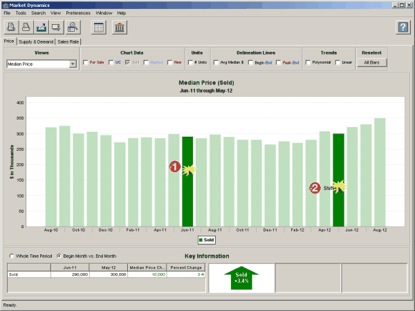
Selectable chart bars
Customize any 1-, 2- or 3-year view:
1.Click on any bar in the chart.
2.Hold down the shift key and click on another bar.
The key information grid and corresponding arrow(s) will be recalculated based on the first and last periods in the selected group of chart bars. Click theAll Barsbutton chart control to reset the selections back to the default.
Key Information
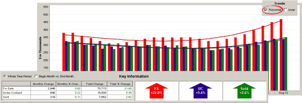
Whole Time Period
This grid displays the incremental change during the time period, using the Linear Least Squares calculation method; it corresponds to the Polynomial Trend Line chart control. Since the value of each time period is used in the calculation, all of the chart bars have the same color intensity.
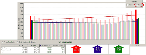
Begin Month vs. End Month
This grid shows the difference between the values of the two full color-intensity bars; it corresponds to the Linear Trend Line chart control. Since the values of the intervening bars are not used in the calculations, the color of these bars is a lighter shade.