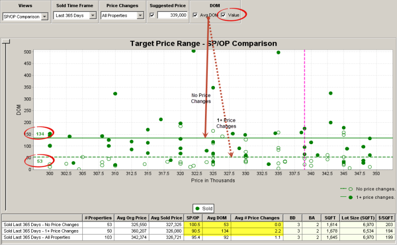
The SP/OP Comparison chart provides a unique look at the outcomes of the two different sales pathways that are an inherent part of the real estate sales process.
The No Price Reduction pathway is indicative of properties that were well priced from the beginning, i.e. they were priced in alignment with market conditions and didn’t need price reductions to sell.
The Price Reduction Pathway is indicative of properties that were priced too high for market conditions and, therefore, needed one or more price reductions before they could sell. This chart compares the results of these two strategies.

The table below the chart summarizes the average outcomes of these two different sales pathways from a key information perspective, i.e. Avg Original Price; Avg Sold Price; SP/OP; Avg DOM; and the Avg # of Price Changes.
In addition, the most typical property profiles for each group are displayed for comparison purposes. In many, many instances you see that the properties that didn’t need price reductions got equivalent or higher prices in a much shorter time frame!
Reviewing the property profile comparisons indicates that sellers who needed price reductions often undersold their properties, i.e. received a lesser price for a larger property.
Sold Time Frame
|
•You can choose the most appropriate date range for comparable properties (Last 365 Days is the default). |

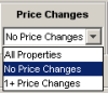
Price Changes
|
Display listings according to their price change histories, i.e. those properties with no price changes, those with 1+ price changes, or the All Properties blend (All Properties is the default). |
Suggested Price
|
•The Suggested Price entered on the search screen, if any, will be displayed here. • If you did not enter a suggested price on the search screen, or wish to change it, just type it into the text box. •When the checkbox is selected, a pink dotted line will be displayed on the chart. |
DOM
|
You can display the difference in average sales times between properties with no price changes versus those with one or more. |
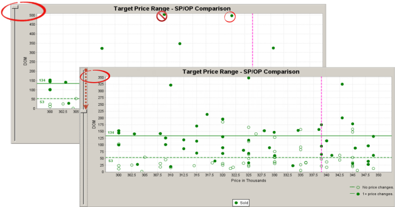
Slider
|
Stretch the chart background to facilitate viewing low DOM properties that have been pushed to the bottom of the chart by the presence of one or more high DOM properties. |
Key to Symbols
|
•Hollow symbols on the chart represent listings that have experienced no price changes. •Solid symbols represent listings that have experienced one or more price changes. |