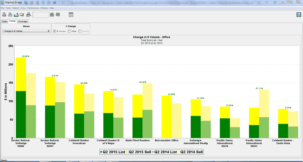
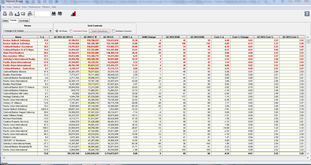
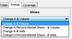
These views display two stacked bars for each entity. Together, the bars represent a time-period over time-period comparison of the status variable selected in the search criteria. The bars are displayed as “stacked” bars in order to represent the type of sold transaction: list side (green) or sell side(yellow).
For example, if Q2 (2015 vs. 2014) is selected in the search criteria, the first stacked bar in the pair for each entity plotted depicts data covering the period from 6/30/15 through 4/1/15 (the most recent Q2) , and the second stacked bar covers 6/30/14 through 4/1/14 (the previous Q2).
Chart View

Grid View

|
